
Bitcoin Rainbow Chart: How to Read It and Use It Like a Pro
Does staring at a bitcoin live chart make your head spin? You are not alone.

In 2026, crypto is becoming a regular part of everyday life. A recent study shows that 4 in 10 U.S. merchants now accept digital assets [newsroom.paypal-corp.com]. But even with all this growth, the charts still look just as confusing to a beginner.
Many new investors get lost in complex terms and flashing red and green candles. They look for a simple way to understand what is happening. That is where the bitcoin rainbow chart shines. Instead of flooding you with data, it uses a simple color scale. Blue means prices are low and it might be a good time to buy. Red means prices are high and the market could be overheating. It gives you a quick snapshot of the market’s temperature without needing a finance degree.
This guide will teach you how to read the Bitcoin Rainbow Chart step by step. We will also compare it to other popular trackers, like a bitcoin price yahoo feed, so you can see the difference. You will learn the biggest mistakes people make when using rainbow charts so you can avoid them. If you are brand new to crypto, start with our complete guide on crypto for beginners to build a strong foundation.

The Bitcoin Rainbow Chart is a powerful tool, but only if you know how to use it correctly. And if you want simple, step-by-step crypto advice sent to your inbox, check out the free Clicks and Trades newsletter. Sign Up here to start learning the safe way.

So, what exactly is this colorful tool that makes crypto feel so much less scary?
The bitcoin rainbow chart started as a simple idea back in 2014. A user named ‘Trololo’ on a forum called Trollbox created it. They wanted a fun way to see where Bitcoin was compared to its own history Ledger.
Here is how it works. The chart uses a math formula called logarithmic regression. Do not worry about the fancy name. It just draws a smooth curve that follows Bitcoin’s long term growth Stoic AI. This curve filters out the daily drama and scary drops you see on a regular bitcoin live chart.
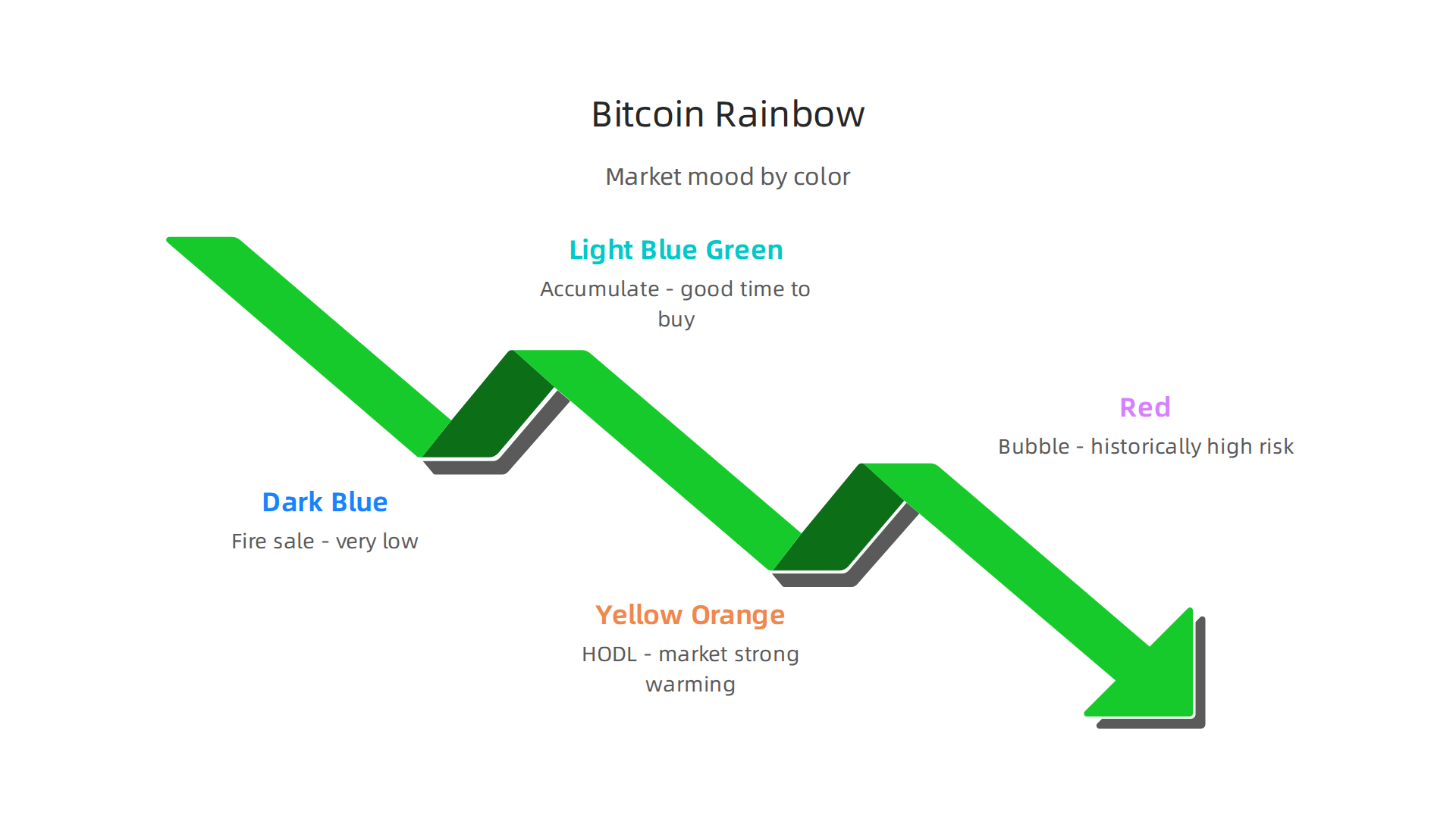
The colors are where the chart gets its name. They show you the market mood at a glance:
- Dark Blue: "Fire sale" zone. Prices are very low compared to the past.
- Light Blue / Green: "Accumulate" zone. A good time to buy.
- Yellow / Orange: "HODL" zone. The market is strong but getting warm.
- Red: "Bubble" zone. Prices are historically high and risky.
But here is the most important thing to remember. The bitcoin rainbow chart is not a crystal ball. You cannot use it to predict tomorrow’s price. It works totally differently from checking bitcoin yahoo finance or a bitcoin price yahoo feed for real time updates. The creator even says it is meant to be a fun look at history BlockchainCenter. Think of it as a long term valuation framework, not a day trading tool.
Instead of panicking at every red candle, the rainbow chart gives you perspective. It helps you see the big picture. That makes it perfect for beginners who want to build confidence without the stress.
Want to practice reading charts without risking real money? Start with our simple guide on paper trading. And if you want more easy to understand crypto lessons sent straight to your inbox, check out the free Clicks and Trades newsletter. Sign Up here to keep learning the safe way.
Understanding the Color Bands
Each stripe on the bitcoin rainbow chart acts like a zone. These zones aren’t made up. They come directly from decades of historical price data.
Let’s walk through the most important ones.
- Blue (Fire Sale): This is the bottom of the market. Prices are historically low. It often looks a little scary, but for someone with a long term view, it can be a strong starting point.
- Green and Light Green (Accumulate): This is the zone that says "cheap." The market is undervalued. For beginners, this is a typical area to start learning about buying safely.
- Yellow and Orange (HODL / Expensive): The party is picking up. The price is moving above the middle of the curve. The chart suggests holding what you have and being cautious about buying more.
- Red (Bubble): This is the top of the rainbow. Prices are historically very high. It signals extreme greed and high risk BlockchainCenter.
These bands are calculated using a special math tool called logarithmic regression Tapbit. This tool removes the daily noise. Unlike checking a bitcoin live chart every hour for bad news, the rainbow chart helps you see the big picture.
For a new investor, this is gold. You do not need to understand complex math to know that green means history says "cheap" and red means history says "expensive." It removes the numerical complexity and helps you stop making emotional choices based on a bitcoin price yahoo feed.
Ready to use this knowledge in a safe place? Start by learning on a trusted platform. Read our guide on how to buy cryptocurrency safely for the first time. And if you want more tools just like this explained in plain English, check out the free Clicks and Trades newsletter. Sign Up here to get started.
Reading the Current Price Position
Now that you know the color bands, you need to see where Bitcoin sits today. Here is how you do it.
First, find today’s price on the left side of the bitcoin rainbow chart. Draw a straight line to the right until it meets the colored curve. What color is that spot? That tells you the current market phase based on historical data. Green suggests the market is undervalued Coin Bureau. Orange or red suggests things are getting expensive. Unlike a typical bitcoin live chart that only shows price movement, the rainbow chart gives you context about whether the current price level is historically cheap or overvalued.
Next, check the date axis at the bottom. Where are we in 2026? The month plus the color band helps you understand where we sit in the bigger cycle KuCoin.
But here is the most important rule. Do not treat this as a buy or sell signal. No chart can predict the future BlockchainCenter. Use the rainbow chart as a starting point for your own research. If you see a low band and feel scared, history says this pattern has repeated before. If you see a high band and want to buy more, the tool reminds you to pause and think.
Want to practice reading charts without risking real money first? Read our guide on paper trading to test your skills safely. And for more simple tools explained in plain English, the free Clicks and Trades newsletter sends clear guidance straight to your inbox. Sign Up here to join.
Why the Rainbow Chart Is Perfect for Crypto Beginners
When you first start looking at crypto, everything feels confusing. You open a bitcoin live chart and see red and green candles moving every second. You check bitcoin price yahoo or bitcoin yahoo finance and the numbers never stop jumping. It makes your head spin. You wonder how anyone makes sense of this.
That is exactly why the bitcoin rainbow chart exists. It takes all that noise and turns it into one simple picture. Here is why this single tool is the best friend a beginner can have.
It stops you from overthinking.
Instead of staring at confusing lines, you just look at colors. Blue means cold and cheap. Red means hot and expensive. That is it.

You do not need to guess where the price will be in five minutes. The visual framework tells you where we stand right now. This clarity gets rid of analysis paralysis. You can finally understand the market without feeling lost.
It makes you feel safer about scams.
Scams work because they use hype. They promise fast money and big returns tomorrow. The rainbow chart teaches you the opposite. It shows you that real value builds slowly over years. If the chart is deep in the red zone, you learn to pause instead of chase. If it is in the blue zone, you learn to stay calm and patient. In 2026, experts say navigating crypto successfully requires holding quality assets long-term and using dollar-cost averaging instead of trying to time the market. The rainbow chart trains you to think that way from the start. It keeps your focus on real value instead of hype.
It helps you feel sure over time.
The more you look at the bitcoin rainbow chart, the more you notice patterns. Prices go up, turn red, cool down, turn blue, and rise again. Once you see this cycle a few times, you stop panicking when prices drop. You start thinking, "I have seen this before." That pattern recognition builds real confidence. You stop making emotional choices and start making smart ones.
You can pair this tool with a solid plan. Using dollar-cost averaging helps you buy at all price levels without the stress. Open a reliable exchange and start small.
The bitcoin rainbow chart is not a crystal ball. But it teaches patience, reduces fear, and helps you avoid dangerous mistakes. It is the perfect starting point for anyone new to crypto.
Want more simple tools explained in plain English? The free Clicks and Trades newsletter sends clear guidance straight to your inbox every week. Sign Up here to join.
The Science Behind the Rainbow Chart: Logarithmic Regression
Okay, so now you know the rainbow chart is simple to use. But how is it actually built? It is not just random colors splashed onto a graph. There is a real science behind those color bands. And the best part? You do not need to be a math expert to understand it.
The tool relies on something called logarithmic regression. That is a fancy term, but the idea is simple. Bitcoin’s price moves wildly. On a normal price chart, the early years look flat and the recent spikes look crazy. That makes it hard to see the big picture. A logarithmic scale fixes this. It squishes the huge spikes and stretches out the quiet periods. As Ledger explains, this formula creates a smooth curve that fits Bitcoin’s historical price path. This is why you can spot long-term trends at a glance without getting lost in the daily noise you see on a standard bitcoin live chart or bitcoin price yahoo feed.
How does the chart know which colors to use? It looks at all of Bitcoin’s past prices. It draws a central curve right through the middle of all that data. Then it adds color bands around that curve. The experts at Stoic AI break this process down and show how the math helps filter out short-term panic or hype. The result is the beautiful rainbow you use today.
But here is the most important lesson in this whole guide. The rainbow chart is a tool for context, not a crystal ball for predictions. It relies on what Bitcoin has already done. According to CoinGecko’s analysis, the model has a "retrospective bias." That means it is great at looking backward, but it cannot predict brand new, never-before-seen events. Tapbit’s guide calls it a long-term valuation model that filters out noise. It tells you where we are in the market cycle. It does not tell you exactly where the price will be tomorrow. Never bet your rent money on a single chart.
So use the rainbow chart as your compass. It helps you stay calm and make smarter choices. If you want to practice using market tools without risking real cash, check out our guide on paper trading for beginners.
Want more clear, simple explanations like this one? The free Clicks and Trades newsletter sends smart crypto guidance straight to your inbox. Sign Up here to start learning today.
Common Misconceptions and Limitations of the Rainbow Chart
You might be tempted to check the bitcoin rainbow chart every morning and make a quick trade. I get it. The colors make it look like a crystal ball. But here is the truth you need to hear: this tool was never built for short-term trading.

The rainbow chart works best over multi-year horizons. Think years, not days or weeks. It shows you which phase of the market cycle Bitcoin is in. That is useful for long-term decisions like accumulating or taking profits slowly. But if you try to use it for a trade you plan to close next week, you will likely get confused. As CoinGecko explains, the chart has a "retrospective bias." It looks backward at what already happened. It cannot tell you exactly where the price will be tomorrow.
The chart can also feel misleading during extreme volatility. When Bitcoin hits new all-time highs, the rainbow bands stretch and shift. The indicator may flash a color you do not expect. Recent analysis from AMBCrypto shows how the rainbow chart did not call the top in a recent cycle. That is because the model relies on past halving cycles. New market behavior can break the pattern. The Arbitrage Scanner guide reinforces that the chart should not be misconstrued as a perfect predictor.
So what should you do? Always combine the rainbow chart with other indicators. Look at on-chain metrics like realized cap or MVRV ratio. Check moving averages for trend confirmation. The Bitcoin Magazine Pro page calls the rainbow a long-term valuation tool, not a standalone signal. This YouTube overview also warns about treating it as one piece of a bigger puzzle.
Here is the bottom line: use the rainbow chart to see the forest, not the trees. It helps you stay calm and avoid panic selling. But never let a single color band decide your next move. If you want to practice combining multiple indicators safely, check out our guide on paper trading for beginners.
Want more honest, practical guidance like this? The free Clicks and Trades newsletter delivers step-by-step crypto education straight to your inbox, with zero hype. Sign Up today and start learning with clarity.
You love checking the bitcoin rainbow chart. I get it. The colors are fun to watch. But remember what we just covered. This tool is for the long game. So how do you actually use it for tracking price without getting tricked by the short-term noise? Here is a simple three-step routine.
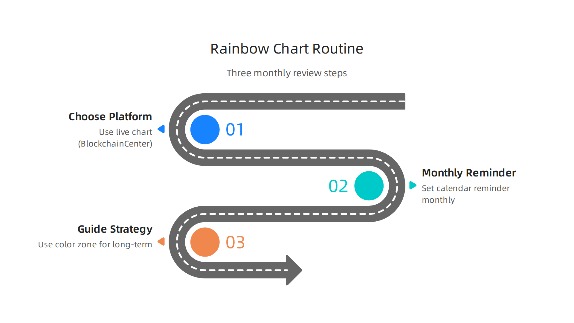
Step 1: Pick a platform that shows a live bitcoin rainbow chart.
You need a site that updates with current market data. The BlockchainCenter live chart is a popular free option.
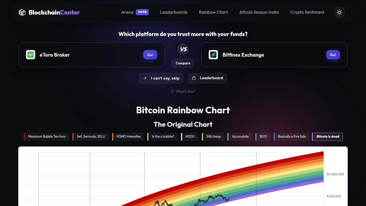
It refreshes automatically and shows you which color band Bitcoin sits in right now. You can also find rainbow chart overlays on TradingView using community scripts. The Zipmex guide explains how to access live versions and what to look for on each platform. Bookmark your preferred site. Make it your one-stop spot for quick checks.
Step 2: Set a monthly calendar reminder to check the chart.
This step is non-negotiable. Pick the same day each month, maybe the first Monday. Open your chosen platform.

Look at the current color zone. Note it down in a simple spreadsheet or journal. Do you see dark blue or light blue? That signals a potential accumulation zone. Are you in orange or red? That might mean the market is overheated. The Coin Bureau beginner guide suggests this monthly cadence because the chart works best over multi-year horizons. Checking daily will only stress you out.
Step 3: Use the color zone to guide your long-term strategy, not a quick trade.
Here is the practical part. When the chart shows you are in the blue or dark blue zone, that is historically a lower-risk area for slow accumulation. You might buy a small amount each month. When the chart climbs into orange or dark red, that can be a signal to take partial profits or simply hold. The key is to make decisions about adding to your position or reducing it based on the phase, not on a single day’s price move. The BYDFi tutorial calls this a "strategic temperature check." You are not trading. You are adjusting your plan.
If you are brand new to buying crypto, you can pair this routine with our step-by-step guide on how to buy cryptocurrency for the first time. It covers setting up an exchange and making your first purchase safely.
The routine takes less than five minutes a month. That is the beauty of it. You are using the bitcoin rainbow chart as a compass, not a speedometer. Over time, you will see patterns emerge. You will feel calmer during dips and less tempted to chase pumps.
Want more simple routines like this one, delivered straight to your inbox? The free Clicks and Trades newsletter sends you bite-sized crypto education every week. No hype, just clear steps to build your confidence. Sign Up today and start tracking like a smart beginner.
Other Beginner-Friendly Bitcoin Chart Analysis Tools
The bitcoin rainbow chart is a great start for spotting big market phases. But no single tool is perfect. You can use a few other simple indicators to double check what the rainbow chart tells you. Think of these as extra lenses. Each one looks at the market from a different angle.
Moving averages, especially the 200 week MA, act like a long term trend line. This line smooths out daily price noise and shows you the general direction. If Bitcoin’s price stays above the 200 week MA, the long term trend is up. If it dips below, that is a rare warning sign. It is a simple yes or no filter. You can find the 200 week MA on any bitcoin live chart on TradingView or CoinGecko. The Kraken guide for beginners recommends moving averages as a core tool.
The Relative Strength Index (RSI) helps you see when the market might be tired. RSI measures how fast prices are moving up or down. The scale goes from 0 to 100. Above 70 often means the market is overbought. Below 30 means oversold. This matches the rainbow chart’s red and blue zones. The Altrady article on indicators calls RSI "hands down one of the most beginner friendly indicators." It is easy to read. Just look for the number.
On chain metrics like the MVRV ratio add a fundamental layer. This metric compares Bitcoin’s current price to the average price at which all coins were last moved. When MVRV is high, long term holders are in big profits and might sell. When it is low, holders are underwater and selling pressure is low. It is like a thermometer for market greed and fear. You can find MVRV charts on sites like Glassnode or LookIntoBitcoin.
All four tools the rainbow chart, the 200 week MA, RSI, and MVRV work best when you use them together. None of them predict the future. They just show you where the market stands historically. For a deeper look at combining indicators, check out our guide on crypto for beginners what nobody tells you.
Want more simple, no hype tools explained step by step? The free Clicks and Trades newsletter sends you one clear tip each week. No jargon. Just practical ways to understand the market. Sign Up today and keep building your toolkit.
Summary
The article explains the Bitcoin Rainbow Chart as a beginner‑friendly visual tool that maps Bitcoin’s long‑term price history into colored bands, where blue suggests historically cheap prices and red signals historically high, risky prices. It walks through how the chart is built using logarithmic regression, how to read the current price position on the curve, and why the chart is best used as a long‑term valuation compass rather than a short‑term trading signal. The guide warns about common misconceptions—like treating the chart as a crystal ball—and shows a simple three‑step routine (pick a live chart source, check monthly, and use bands to guide long‑term strategy). It also recommends pairing the rainbow chart with indicators such as the 200‑week MA, RSI, and on‑chain metrics, and points beginners to safe practice options like paper trading and testnets before risking real money.